Sentiments and Stock Prices – Effects on Apple Inc
Admin Rating
Infographic Reviews Editor
This infograph is a must share to those who are investing, or to those who would venture on stocks.
This infograph is a must share to those who are investing, or to those who would venture on stocks.
This infograph is a must share to those who are investing, or to those who would venture on stocks.
Let’s talk about the content.
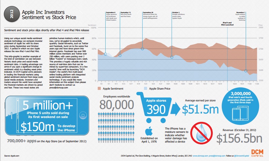
It tells us the weight of sentiment to the stock price specifically in the case of Apple Inc. Starting the whole infograph with a paragraph is a good idea. After all, not all people are aware of this ‘movement’ in the trade. Some old- fashioned investors would not even care about what the social media is telling us. But now, I think they will change their minds.
There are also information about Apple Inc which will make the audience more hooked up. Some people would like to know how many units have been sold. It’s fascinating to know that on its first weekend, there were more than 5 million units purchased. You’d also find out that Apple Inc is indeed a huge company for having more than 80,000 employees.
Now, let’s move to the design and layout.
It’s in order. Things about the sentiment and the stock price are on the top portion of the infograph. The less needed details are in the bottom. But I would suggest that they put the word “date” on the lower part of the graph as it is a bit confusing.
All in all, this is a fine work.
Thanks DCM capital for this good infograph.
You might want to check their site should you want to know more about spread betting. And for those who are interested in CFD Trading, this is a nice source as well.


